


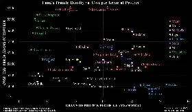
Its not really clear what the graph is trying to show.
Food being farther right along the x-axis is not inherently better unless weight is a concern. Maybe if you’re hiking or going to space or something, you would want to bring as much protein as possible with minimal weight.
What the graph really says is that legumes have a very low water content relative to other foods like meat. If you dry meat to make jerky, it would be off the chart to the right, around 60% of the total mass being protein.
The y-axis, cost per gram of protein, is interesting on its own. Plotting it against some other variable could maybe show some relationship between $/g and that other variable…
… but this graph doesn’t show much relationship at all, other than “similar foods will land in similar areas on the graph.”
Other people at the gym meticulously crafting their protein intake
Me: gimme that n u t
i will eat a gallon of peanut butter


Mostly fat so you gotta buy the defatted flour (which still has quite a lot compared to TVP)


the beanis and its friends are simply incapable of stopping their winning streak
also, “pinto” means dick in my language
Do they make textured defatted peanut flour products
edit:
Peanut-based TVP is produced in China where peanut oil is a popular cooking oil. (Wikipedia)
I need to go to China
edit 2:
dead link and I can’t find any other sources
edit 3:
does anyone want to buy an extruder with me


