

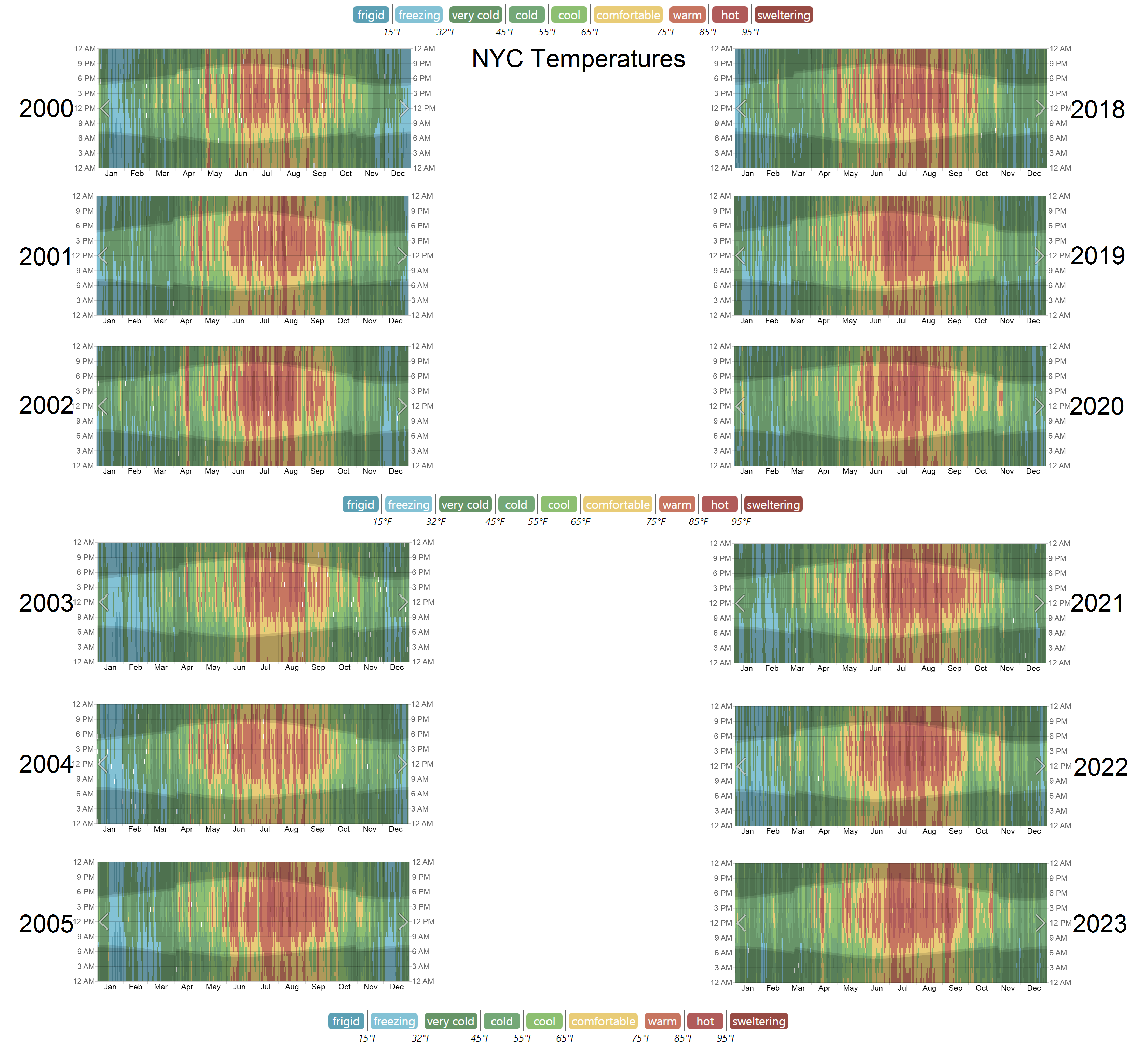
I skipped the years 2006 - 2017 to make the change look more obvious
I recommend viewing it full screen and glancing back and forth between different years
2002 was a freak hot year
In the 2000s you see a lot of yellow and green interlaced into the summer nights, and much less dark red.
You also see much more blue in the winters
It took only 18 years to get to this point (the difference between the median years of the two data sets), and since it’s always faster than expected, we probably got ~9 years for the next equivalent amount of change, and then ~4 years for the next one after that, except it’s probably even faster than this so ima say 3 years till the nukes fly

this graphic design is quite bad. the color explanation looks like a separator, but that’s not how the years are separated
This is good work. How/where did you source your data?
it’s from weatherspark.com
I just copypasted them in MS paint


